How does an individual decide whether or not to attend a webinar? It is primarily related to the webinar invitation’s approach. The purpose of webinar invitation emails is to make it as simple as possible for individuals to confirm attendance and see what’s in it for them.
In this article, we’ll analyze the various components of a webinar invitation email and illustrate how to design the ideal email to promote your webinar.
6 components of a webinar invitation email
Great email campaigns come in many shapes and forms. However, a webinar invitation email usually consists of 6 key components – your subject line, banner image, header text, webinar introduction, webinar details, and call to action. Read on to learn how to optimize each component.
1. Catchy Subject Line
The subject line for a webinar invitation should follow the same rules as any other email. It should not be excessively long in order to avoid being cut off by email clients. Additionally, it should clearly state the message’s subject and describe the content contained within.
- Include in the subject line the word webinar to identify the message from the start:
Webinar Invite: How to kick-start your career in Management?
[Webinar] Achieve True Dimensional Accuracy in 3D Printing.
- Add How to: state the practical use and knowledge the participant will learn from your event:
Learn How to Make Graphics from Scratch!
Tomorrow: How to give every client an extraordinary experience.
- Set the suspense by asking leading questions:
Is IT right for you?
What to Do If Your GMB Listing Gets Suspended? [Live Q&A]
- Introduce speakers, especially if their names are world-famous:
Webinar: Interview with renowned photographer Sean Conboy.
Zoom with Exhibit View Software with Kyle Newman, Esq.
- If your event is free, focus on its availability:
We’re excited to invite you to our free webinar.
Free Webinar: Be your own boss & teach English online.
2. Banner Image
Here are a few webinar invitation email banner best practices: Ensure that your text stands out clearly against your background, that the banner contains all necessary information, and that it includes pictures of your hosts/guests. Additionally, you may want to include a call-to-action on your banner.
Even without reading the further agenda, this banner clearly states the purpose of the webinar and provides all details.
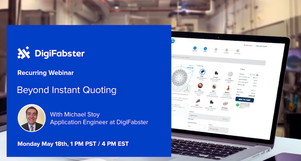
Banner in webinar email invitation by DigiFabster
This is how you can combine several speakers within one banner.

Banner with several speakers in webinar email invitation by Bitcoinira
For B2C companies, it’s better to include more visually appealing images that would rather cause an emotional response and demonstrate benefits of the offer: a fit athlete for a fitness workshop, a model with healthy skin for a beauty webinar, a delicious meal for a cooling masterclass.

Banner for B2C webinar email invitation by Real Ketones
3. Header Text
Most people simply repeat the name of their webinar or the topic of their webinar in their header text, but this adds no value to your prospect. Instead, try appealing to your prospect’s pain point or emphasizing a benefit of attending your webinar.
Here are some negative examples:
- Live Content Marketing Webinar By Company ABC
- Join Our Live Content Marketing Webinar
- 25th February 2019 – Live Content Marketing Webinar
And some positive examples:
- Want To Skyrocket Your Content Marketing Conversions In 2019?
- Figure Out Why Your Content Strategy Isn’t Working, Once And For All.
- Discover Tried-And-Tested Strategies Used By Neil Patel And Brian Dean.
4. Webinar Introduction
Your webinar introduction serves as a prelude to your pitch as to why prospects should attend your webinar. Instead of focusing exclusively on the details, share what your prospects can expect from your webinar.
Here’s a negative example:
Join us for a content marketing webinar on 25th February 2019. The webinar will kick off at 9 am PST, and it will be hosted by content expert Neil Patel. We will start off with a 20-minute sharing session, and close with 10 minutes of Q&A from the floor.
And a positive example:
Ever wanted to pick Neil Patel’s brain, and learn the specific strategies that he uses to generate up to 1.2M readers PER blog post? Now you can. Join us at our content marketing webinar hosted by Neil, and stay tuned for the last 10 minutes, where we open the floor for you to ask him all your burning questions.
5. Details of the webinar
Each webinar email typically includes an event agenda – a concise summary of the event’s key takeaways. Here, you can provide additional details about the topics that will be discussed.
The more attendees and presenters at your event, the more detailed the agenda should be. While the webinar title may appear too broad, more specific topics can sound more relevant and elicit a stronger response.
6. Call to Action
Finally, end with a Call To Action button that is linked to a webinar landing page. This is where your prospects will RSVP for your webinar. A CTA is a required element of any email you want to prompt an action with. It should be noticeable and convey a direct and understandable call. If you’re asking people to register for the webinar there’s no need to reinvent the wheel.
Interesting to note: studies have shown that Call To Actions written using first-person pronouns perform better than those written in second person pronouns, so instead of saying “Reserve YOUR seat”, “Reserve MY seat” might work better.
Here are some other variants you can A/B test:
- Reserve my spot
- Claim my spot
- Save my seat
- Save me a seat
- I’m in!
elfoMAP webinar software gives you the best online experience with built-in design to nurture relationships with your contacts.
Best webinar invitation email examples to get inspired by
We’ve scoured the web, and found some of the best webinar invitation emails that you can draw inspiration from. Time to get those creative juices flowing!
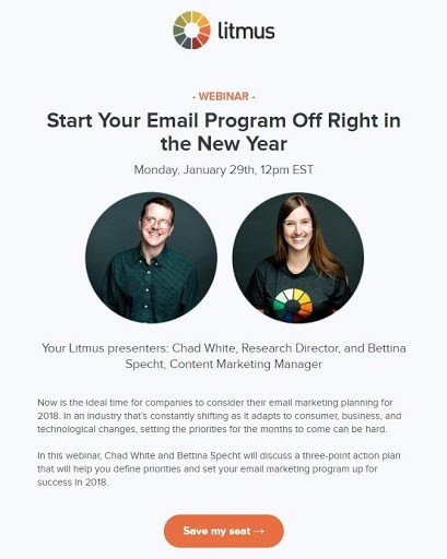
a. Litmus Webinar – Simple, yet efficient design
The company’s name in the email header, a plain yet light email background with bold fonts, a bright banner, and a simple design all contributed to the endearing simplicity of the Litmus webinar invitation. The speakers’ bios, along with their pictures and the webinar agenda, were all mentioned explicitly in this webinar invitation email.
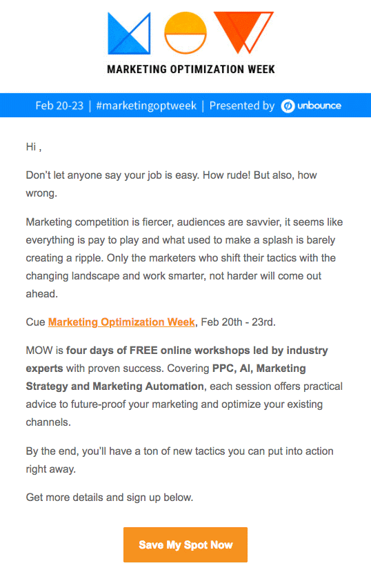
b. Marketing Optimization week by Unbounce – Catchy Logo
Unbounce’s webinar invitation email stands out due to the company’s unique brand logo. This catchy logo was memorable owing to its special design. It showed the importance of the brand itself. This week-long workshop was hosted by Unbounce and covered a variety of topics. Furthermore, the brand’s logo confirmed that the workshop would be presented simply and decently, leaving a lasting impression on the minds of the readers.
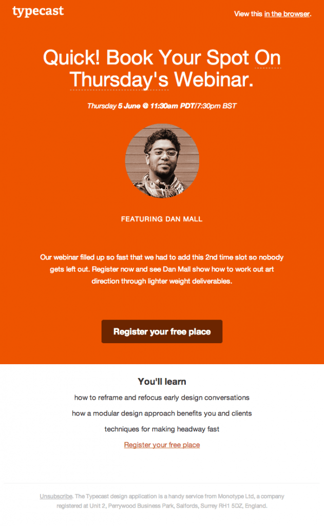
c. Typecast Webinar – Brand colored masterpiece
The colour scheme and fonts used in this webinar invitation email are consistent. This choice was made to reflect the company’s real name in its small form. Readers are used to seeing capitalization in the first word of a sentence, so this change of using lowercase letters can be an eye-catching strategy to grab readers’ attention.
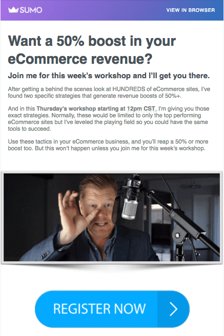
d. Sumo Webinar – Masters of the catchy headline
When you talk about attending a webinar, the most significant cost which comes in mind is not money but time. It’s important to clearly describe exactly what the attendee will gain if they attend your webinar. An example of a webinar invite with a clear benefit would be something like:
“After attending our webinar, the strategies you learn could help you increase revenue by 50%.”
As soon as the reader gets the information about their benefit, the chances are higher that they respond quickly and participate in your webinar.
BONUS: Sending a series of webinar invitation emails
A well-crafted webinar invitation email can be extremely effective. Your take-up rates will skyrocket if you send a SERIES of emails (or an email sequence). However, I’m not asking you to contact each person who ignored your initial email. Engaging in such arduous activity makes no sense.
Set up an automated email campaign instead to send emails to those who did not open your initial email (or those who did open it but did not click/RSVP).
If you want to target the former (people who did not open), use EXACTLY the same content in your body email and simply change the email title. Isn’t that straightforward?
If you want to target the latter, you’ll need to get a bit more creative. I recommend using some humor here, for instance:
- Email title: [Webinar] Don’t keep us hanging, because someone else wants that seat…
- Email copy: Hey, {Name} – are you still interested in attending our webinar, where you’ll learn how to do X, Y, and Z? Slots are filling up fast, and if you don’t want that seat, somebody else does!
A final word on designing the perfect webinar email
In short, a strong webinar invitation is an essential component of a successful webinar because it serves as the entry point for attracting viewers and convincing them to attend your event. The packaging reflects what’s inside the box: a unique email header, a webinar or company logo, plenty of details, webinar content, a description, a webinar schedule, a colour scheme, and a design. That’s all it takes to successfully send out webinar invitation emails!
If you are ready to design your webinar invite, you can entrust our team to create your email with elfo’s Email Marketing Managed Services.
