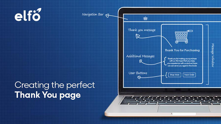
There has been one site page that online users have so often seen but skipped – the Thank You page. Often cobbled together in short time, what many people don’t realize is that the Thank You page can serve as a great point to get visitors to help achieve a variety of business goals. In this article below, we’ll review 7 “Thank You for Contacting Us” page best practices to increase ROI and nail lead generation.
Before we get started, it’s a helpful reminder to define what a Thank You page is. It’s a site page where a visitor is redirected to after filling out a form or purchasing something on your landing page. It’s where you reinforce the promise made on the last page (i.e. send the delivery, create an account, etc.), and most importantly, it’s another major opportunity to nurture the lead down the sales funnel again.
Related topic: How to Write A Good Landing Page Copy That Sells
3 Components of A Good Thank You Page Template
Let’s break down the bare minimum that your “Thank You for Contacting Us” page must contain. Whether it’s intended for the viewing of new subscribers or returning customers, it’s important that every Thank You page consists of at least these 3 components:
- Message of confirmation;
- Instructions/next steps the person should take;
- And clear call-to-actions (CTAs).
Miss out on any of these simple but key ingredients early on and your Thank You page could easily lose you ROI before you even start optimizing! Let’s briefly highlight each component by using the example below.
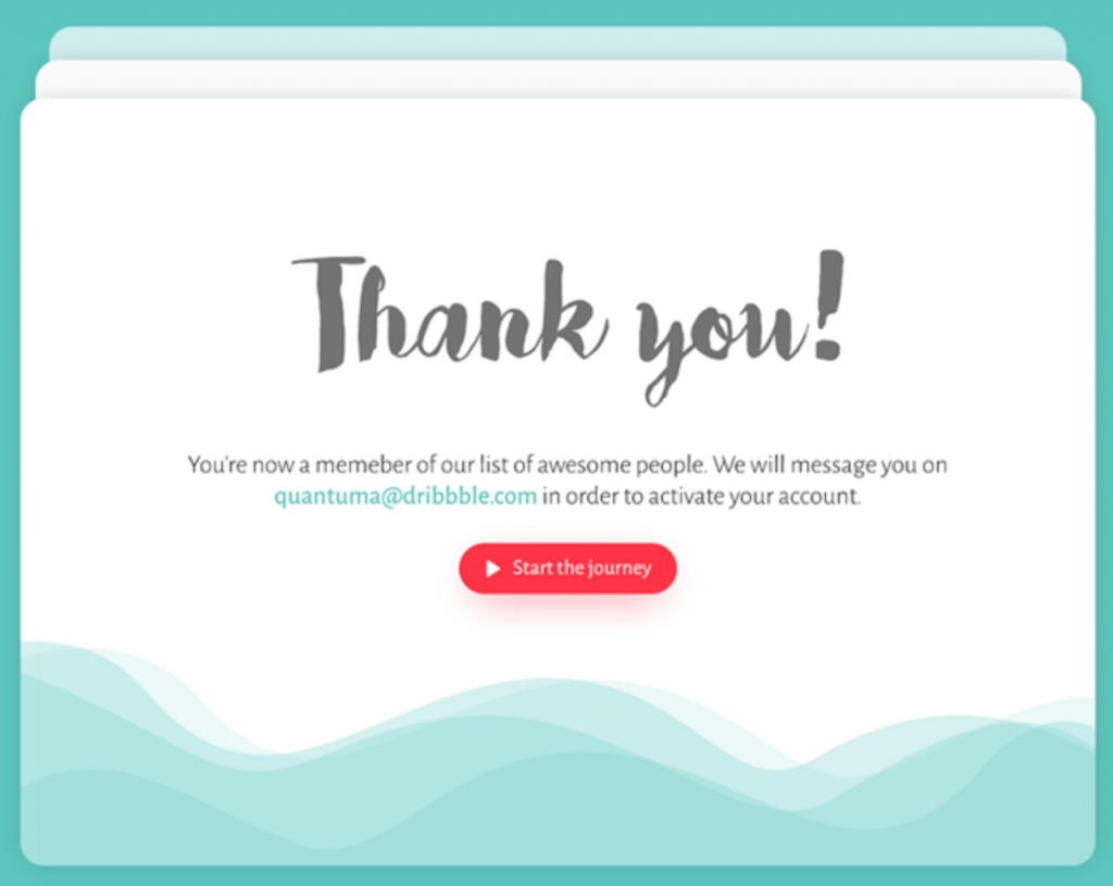
1) Message of confirmation
Right off the bat, this Thank You page confirms that the user’s action was successful. When your page loads up on the screen, the message has to be especially clear for users, otherwise they could end up confused about what happened. A straightforward “Thank you for subscribing.” or “We received your order!” will do just fine.
2) Instructions/Next Steps
The second vital thing to include in your Thank You page is instruction(s) on exactly what the person should do next and how to do it. In this example, it’s informing the user that a message will be sent to their email to activate their account, which the user should check. Your instructions don’t need to be lengthy – they just need to be clear, precise and actionable.
3) Call-to-Actions (CTAs)
The final component is to add an effective call-to-action (CTA) to move your users onto the desired step in your sales process/customer journey. This is the part where most Thank You pages miss the mark, because adding a persuasive CTA could make the world of difference in terms of your conversions and sales. Here you can inject some fun and creativity as long as your CTA is clear and related to the attacked hyperlink.
Now that all 3 components have been established, let’s move on to the ways to optimize your Thank You page for further lead nurturing and lead generation.
Creating a High-Converting “Thank You for Contacting Us” Page
Perhaps the biggest challenge for your Thank You page is to retain your viewers after they completed the original thing they came for. If you can entice them to explore more of your website instead of clicking away, there’s a huge potential to convert new subscribers into paying customers or even get current ones to purchase more. Grab every opportunity to woo your visitors!
Tip #1: Push A Promo
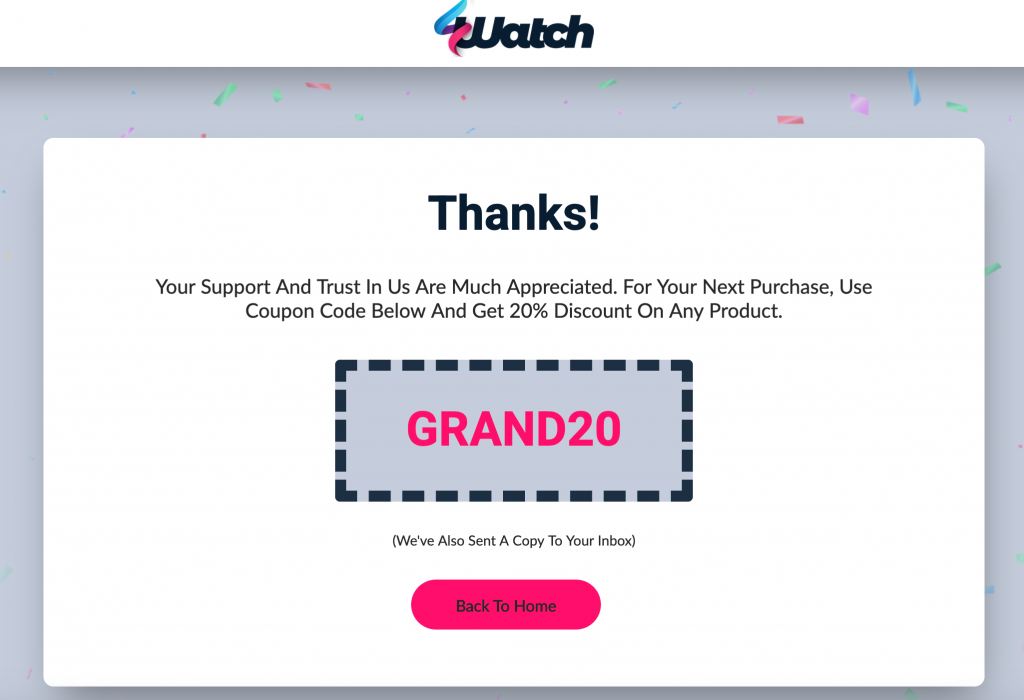
Don’t want your customers to be one-off purchasers? Then make sure they’ll come back for more by offering a voucher or coupon code for their next purchase. As shown in the sample below, the sincere message is followed up with a nice discount – why wouldn’t your prospects have a good reason to come back?
The Thank You Page can be a great place to promote things like:
- a special offer for new subscribers
- other products or services you offer
- advertisements (i.e., affiliates, Adsense)
Created using elfoAIM.
Tip #2: Provide Links to Other Content on Your Website
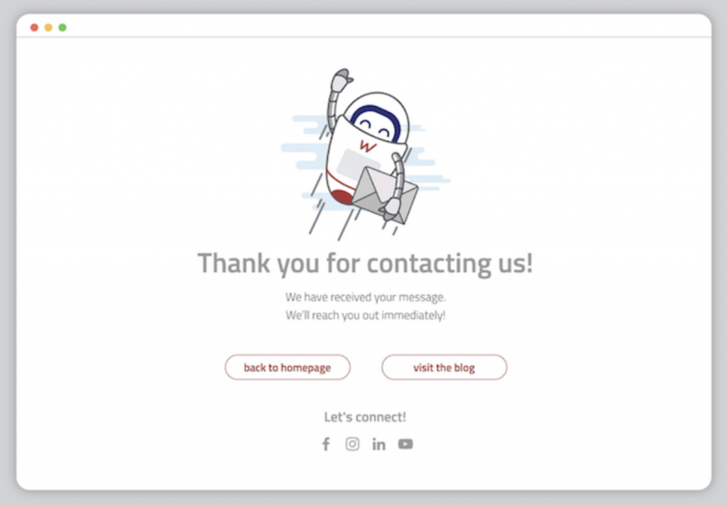
Of course, you mustn’t create ALL your Thank You pages to be overtly salesy. Strike a fine balance by leveraging some Thank You pages to be a helpful resource page that directs your prospects to other landing pages of equal usefulness. Providing links to other content on your website may not only encourage people to make a purchase later, but it also builds trust amongst readers by supporting your expertise in that area.
Keep in mind that linking to your own content increases the potential of those articles ranking on Google and the chances they’ll be shared on social media. Here are some common examples of the types of content you can link to:
- relevant blog posts
- infographics
- resource pages
- guides and tutorials
Tip #3: Display Social Proof from Previous Customers
Nowadays, it’s become quite tough for consumers to determine which products are real and not a scam online. Displaying relevant customer testimonials and case studies on your website is an easy way to help build trust amongst cautious buyers. So why not include social proof into your Thank You page too? Adding social proof can help convince brand new subscribers to make a purchase and contribute towards your conversion rates.
A Tool to Facilitate Easier Market Research
With data privacy concerns on the rise, getting the information that you want from potential prospects may become a difficult task in the future. If you’re struggling with actionable means for market research, the fact is you can leverage your “Thank You for Contacting Us” page as a channel to collect data from an already established audience. It’s one of the smartest (and easiest) tools to utilize to promote better content, acquire deeper customer insights and improve how you market your goods to your visitors.
Tip #4: Grow Your User Base
For most e-commerce platforms where guest users check-out and pay, they miss out on the prime opportunity – when their guard is down after having the made purchase – to add these people into their user base. The “Thank You for Contacting Us” page can serve as the best point in the customer journey to approach visitors to sign up for a user account and get informed on promotions or goods they’re interested in through their registered contact details.
In the sample below, the Thank You page asks the user to create a password and the company will generate a user account for them on their behalf. It takes the extra step to also encourage the user to come back by offering a small discount for their next purchase as a return customer. This automatically ensures the company adds a new subscriber to their email list.
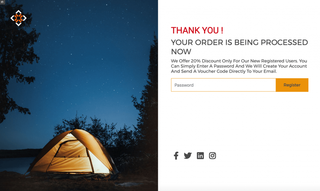
Created using elfoAIM.
A smart Thank You page may also give customers a compelling reason why they need to share their information with the company, such as their contact details. In this next sample, the Thank You message simply indicates to the customer that the next step to take is to pass their mobile phone number to the company so that they will be informed of their delivery through free SMS.
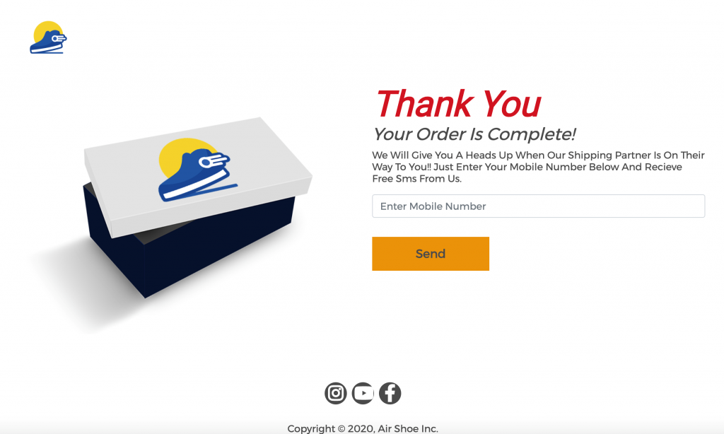
Created using elfoAIM.
Tip #5: Get Visitors to Tell More about Themselves
The more you can find out about your visitors, the richer your set of market research data can be. Insert a feedback form/survey into your Thank You page to derive actionable insights from your subscribers and purchasing customers. Simply ask them to answer a short series of questions and make it clear that it won’t take them very long to do so (ideally around 5-10 minutes).
By acquiring a clearer picture of the reasons – the what, why and how – customers interact with your website, products and services, you can use the information to create new blog content, tutorials or even products/services that you know your audience needs. Here are some questions you could ask:
- What made you subscribe?
- What’s your biggest issue when it comes to [problem, area of expertise]?
- Has our new [product, service, feature] been useful?
- Do you have any [product, service, feature] you would like to see?
Nothing beats getting answers straight from your customers to spot problems and opportunities in your business.
Spreading Your Brand’s Reach
Social media has dominated the Internet landscape with its ability to gain mass traction if the message resonates with people. Why not take the chance to market your brand through encouraging your subscribers on your “Thank You for Contacting Us” page? You don’t want new subscribers to forget about you, so engage your subscribers on a regular basis so that they will always remember you.
Tip #6: Ask Subscribers to Share Your Website
If you already have social share buttons in the sidebar or footer of every one of your landing pages, great. But are you actually seeing any real use from them? With the top business priority focused on promoting products and services, most companies tend to neglect and forget that these buttons exist on their website, let alone the Thank You page.
Google’s algorithms place a lot of weight on social sharing nowadays, so your goal should be to build brand awareness by getting people to share your website as much as possible. Don’t simply assume that visitors will share your content just because there’s social share buttons on every page. While they’re in the mood to get something from your website (that’s why they’re on the Thank You page to begin with!), your visitors will not usually think to share something with their friends unless prompted.
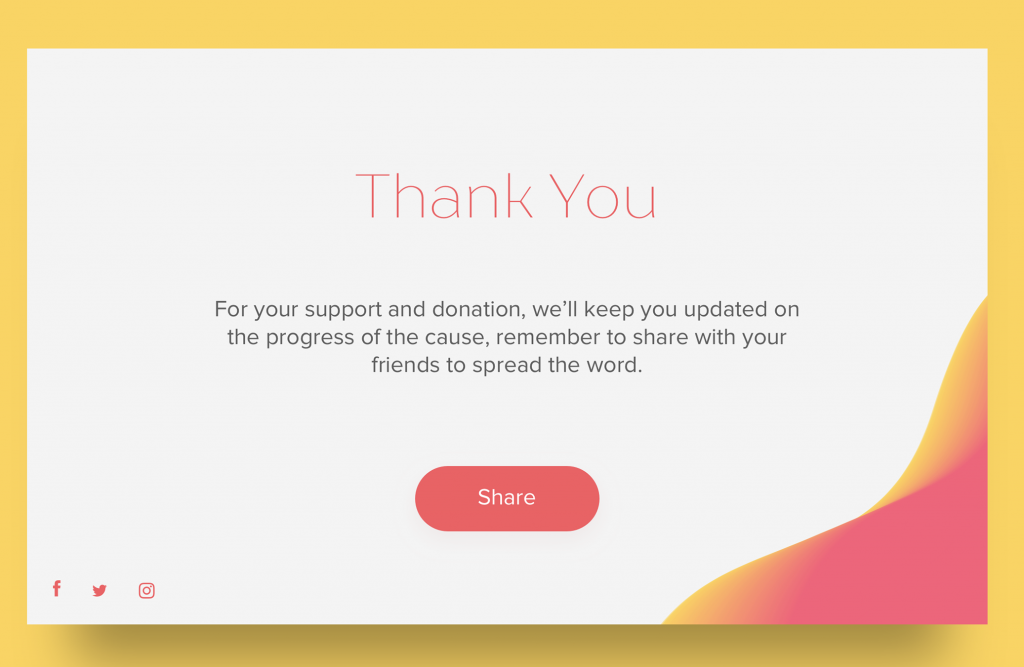
Like the sample above, just request your subscribers to share your website and follow you on social media. Perhaps let them know that social media is an alternate way to subscribe (if they’re not comfortable directly handing over their contact details).
Tip #7: Encourage Participation From Your Subscribers
Maintaining a loyal user/subscriber base means going the extra mile in establishing and building a strong community around your brand. By actively encouraging visitors to participate in arranged events, this can easily lead to more sales and even repeat customers for your business. If you have the resources in place, take the opportunity to either create CTAs or highlight links in your Thank You page to community-oriented features such as podcasts, forums, etc.
Conclusion: The “Thank You for Contacting Us” Page Is An Underutilized Weapon
Increasing ROI doesn’t have to be hard if you can realize the potential of your Thank You page. By implementing these key tips, you can raise the standard of your page from a typically boring one to something that can actually bring in more sales for the business.
Regardless of whether you’re trying to gain customer insights, have a go at another sale or get more social media followers, a Thank You page should also attempt to be as high-performing as the product/service pages you put so much thought and effort into.
If you want to easily create nice-looking Thank You pages like the ones used above, why not sign up for elfoAIM? Save time and effort on building landing pages from scratch with a drag-and-drop toolkit and a library of attractive landing page templates to choose from.
